Friday 10 February 2012

Our Nursery, what it will be....

Photobucket Pictures, Images and Photos

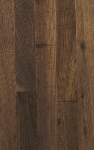
The nursery design, as it is currently,is my short term 'lets do this as inexpensively as possible' fix. Besides the paint on the walls, I didn't address any of the existing finishes in the space. At some point we will replace the grey broadloom with hardwood flooring. I've thought about many different species of wood floors to install but have decided that we'll put a black walnut plank flooring with a clear finish throughout the house, including all bedrooms & the nursery. I like black walnut because it's a timeless hardwood. It has a balanced variation of warm & cool tones throughout the wood grain.

Photobucket Pictures, Images and Photos
via

A wool or cotton area rug will be needed so that little feet and little bums have something soft & cushiony to plop down on. The area rug should be graphic/patterned, colorful and gender neutral...something along the lines of the following samples (although I know my husband would object to the pink in some of them):

Photobucket Pictures, Images and Photos
via

I 'love' this Dash & Albert rug but sadly it's out of our price range for the nursery & the husband might find this too feminine.

Photobucket Pictures, Images and Photos
via

This is a gorgeous limited edition rug by Malene B. Again out of our price range & maybe a tad too much pink but I love the strong colours & geometry.

Photobucket Pictures, Images and Photos
via

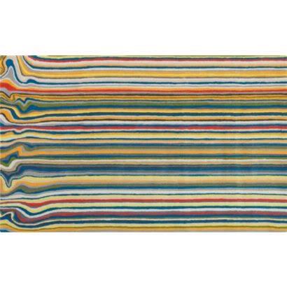
This is definitely more 'boyish' & affordable. I like how the linear stripes take on a free form line at one end. It reminds of melting crayons for some reason.

Photobucket Pictures, Images and Photos
via

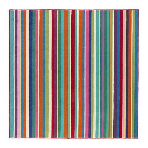
This Ikea rug is definitely in our price range. I like the variation of colours and the square shape is more suitable to the space. I'm not crazy about the binding edge but it's colourful, wool fibre & affordable.

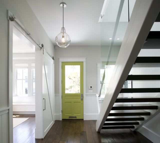
Another finishing detail to be addressed is the door, window & floor trim. We currently have the same basic 2" builder trim on all the door frames, window casings and baseboards. It is plain, uninteresting, and boring. Changing the trim details will make a huge impact in the space. Right now I'm thinking that I'd like to add trim detailing that is something similar to this:

Photobucket Pictures, Images and Photos
Feldman Architecture via

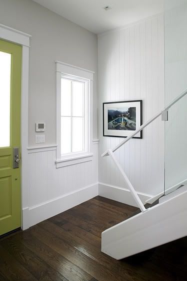
I'm using the above photo to reference only the door trim & height of the baseboard, ignore the chair rail & wainscot.

Photobucket Pictures, Images and Photos
Feldman Architecture via

The above photo is only in reference to the window casings.

We also want to eventually replace all the doors in our home. There's no disguising the faux recessed paneled doors. They scream basic builder grade. I'm still undecided on 'the' door style but am leaning more towards a single recessed panel/shaker style door in a white paint finish. No faux wood grain in pressboard, just a solid wood door with a properly constructed recessed panel. And no ogee edges or trim detail around the recess! Just simple clean lines.

Photobucket Pictures, Images and Photos
via

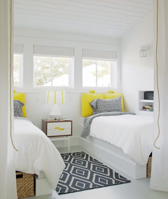
The ceilings throughout our upper level of the house are a huge peeve of mine. They're all a spray texture finish, not as heavy as a popcorn ceiling but not flattened out or a fine texture either. They're somewhere in between and awful! Of course the nursery is one of the lucky rooms to have this ceiling finish. My resolution for all these ceilings is not to scrape the textured finish off (too messy & I don't want to live through that) but install +/ 3" wood planks with a white paint finish over them. It will add a subtle texture throughout the house and allow me to change current lighting locations without having to do any drywall patching. The wood plank ceilings will be painted white & not white washed, stained or left natural (there will be enough wood grain pattern from the black walnut floors so the ceilings do not need to compete with that). The painted wood finish will be similar to the following image but on a flat ceiling plane.

Photobucket Pictures, Images and Photos
via

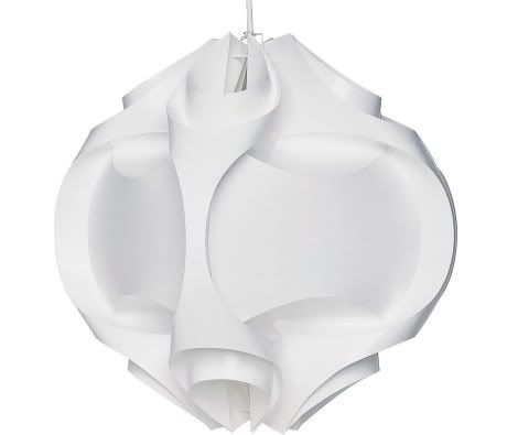
I've always loved Le Klint light fixtures and I think our nursery is the perfect space for one. 

Photobucket Pictures, Images and Photos
Le Klint 167

One reason why I chose to add the green horizontal band on the walls around the nursery (aside from thinking I might run out of paint and would use less that way) was so that we could add the wood ceiling, hardwood floors & trim/baseboards without disturbing the walls too much. I have plenty of off-white paint (used on the doors & trim) leftover to use for these future changes. Of course touch ups would be required but we can replace the new floor & ceiling finishes with minimal disturbance to the main wall colour.

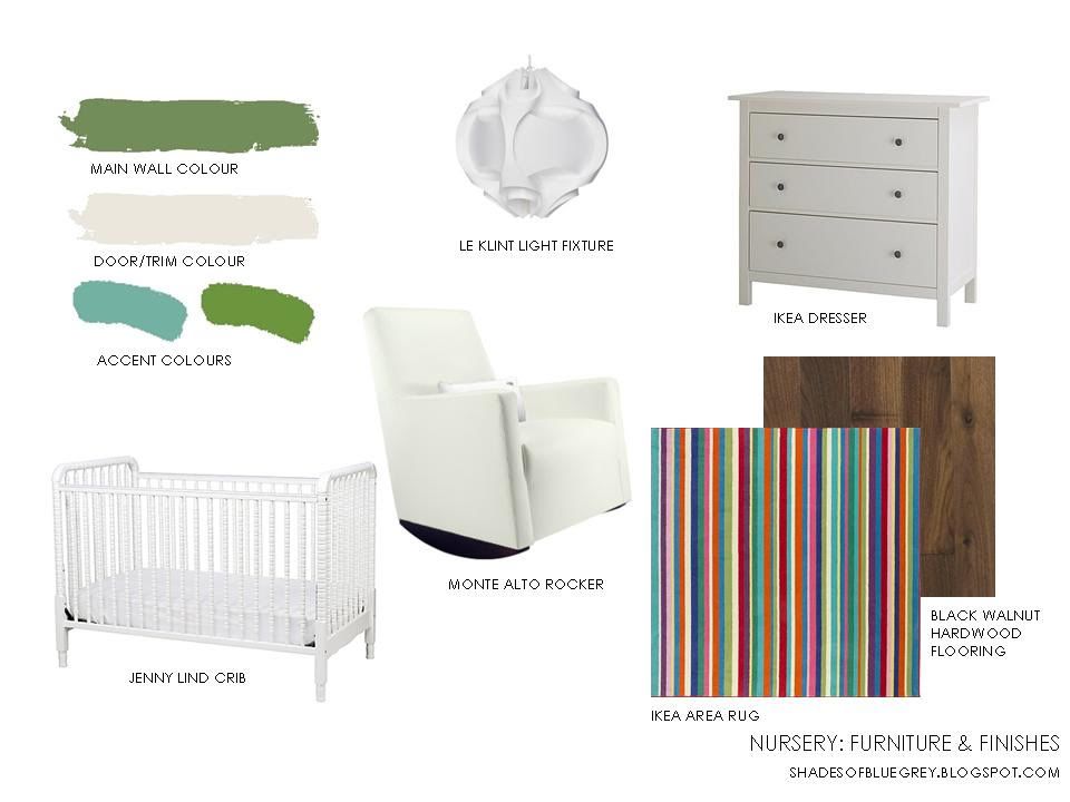
So we've got new floor & ceiling finishes, trim details, area rug options and lighting to still install in the nursery to complete it. What will these new materials look like with the existing white furniture in the finished space? 

Photobucket Pictures, Images and Photos

The hardwood flooring will ground the space & provide contrast to the light ceiling & white furniture. The area rug breaks up the mass of the walnut floor and provides a stronger mix of colour & pattern in the room. It also provide a cushiness that a nursery should have underfoot. 

Currently we only have one baby but we do plan on expanding our little family with one more. Our son, who is about 18 months now, will move to the room next door to make room for baby (whenever that time comes). I  didn't use a 'theme' when designing this space because I didn't want our kid to ever 'grow out' of this room. The space is designed to reflect our child as they grow & their interests change. Artwork can be replaced, accessories can be switched, the green wall colour can easily be painted over (with no cutting in at the ceiling & baseboards), area rugs can be changed, etc....but no major overhaul to the finishes & furniture will really be needed since the space will adapt with our growing child (other than replacing the crib with a twin bed).

Photobucket Pictures, Images and Photos

And that, my friends, is the final design plan for our nursery.
Monday 6 February 2012

Our Nursery

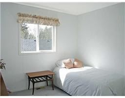
This is the first room in our house I wanted to pull together since it would mean interrupting our babe's routine in order to do so. The sooner I could get that disruption over for him the better. Following is an image of the nursery before we moved in.  It's a pretty sad 'before' picture, not only because its a low res image from the realtor, but because it was such a bland, little white box. See those white'ish walls? Yeah, that's not white paint you're looking at but what I highly suspect as primer only. For 17 years, primer only. Same goes for all the doors in this room. Primer only and it was yellowing. Not a good look especially when paired with a grey & peach window valance, cheapo horizontal slat blinds and primed only walls.

Photobucket Pictures, Images and Photos

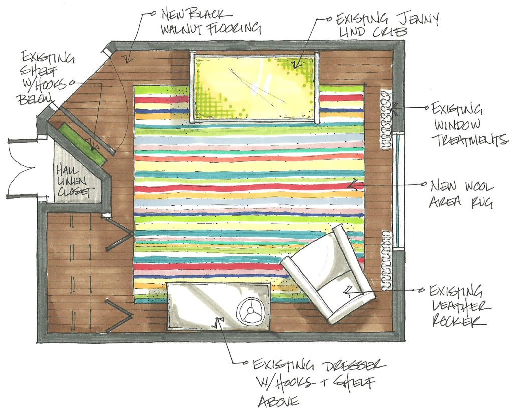
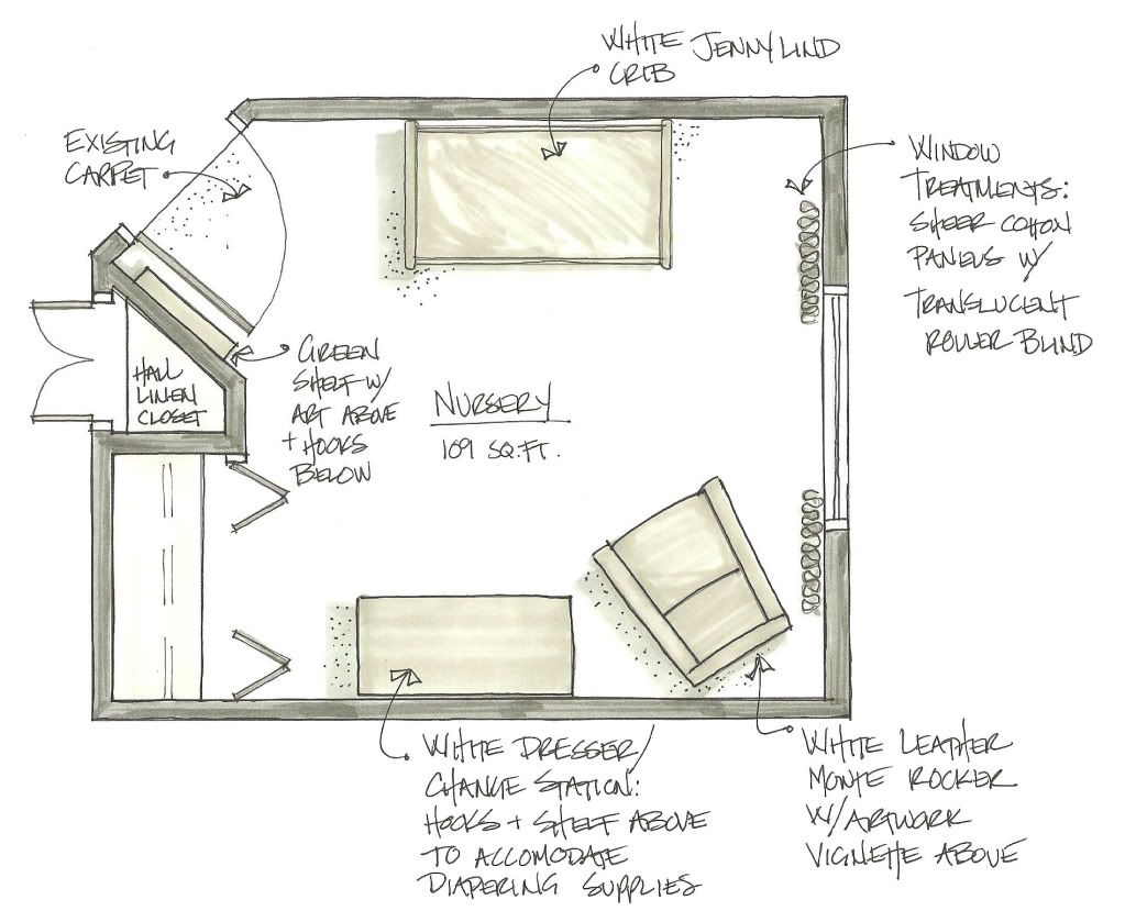
Here's a basic furniture plan of the nursery, as it is now, showing the main pieces of furniture in the space (which are all from our previous nursery).

Photobucket Pictures, Images and Photos

When I was pregnant we didn't find out what we were having, leaving it to be a surprise at the baby's delivery & we plan to do the same with our next little one. So our previous nursery needed to be gender neutral & we chose a green colour for the walls which was the 'only' colour we could both agree upon. The boy will eventually move from this nursery & go next door into his 'big boy' room to make space for a new baby brother or sister. Clarification - I'm not pregnant, just thinking ahead for when we do expand our little family. Anyways, that's my very long, over expanded explanation as to why our nursery has green painted walls.

It's a pretty boring, small room lacking in any details. Since we're trying to make changes as 'economically' (read cheaply) as possible, my only option was to use paint in the space to add some kind of interest. I already had about 3/4 of a can of green paint from our previous nursery, so I only needed to buy some off-white paint for the doors & trim. I also used some turquoise paint & another brighter green paint (that we again had used in the old nursery) in the room as accents. Those are  Martha Stewart test sample pots from Home Depot, Araucana Teal  & Bay Leaf. Each little sample pot has surprisingly gone a long way.

So here is what a little paint did to the room...

upholstered monte rocker

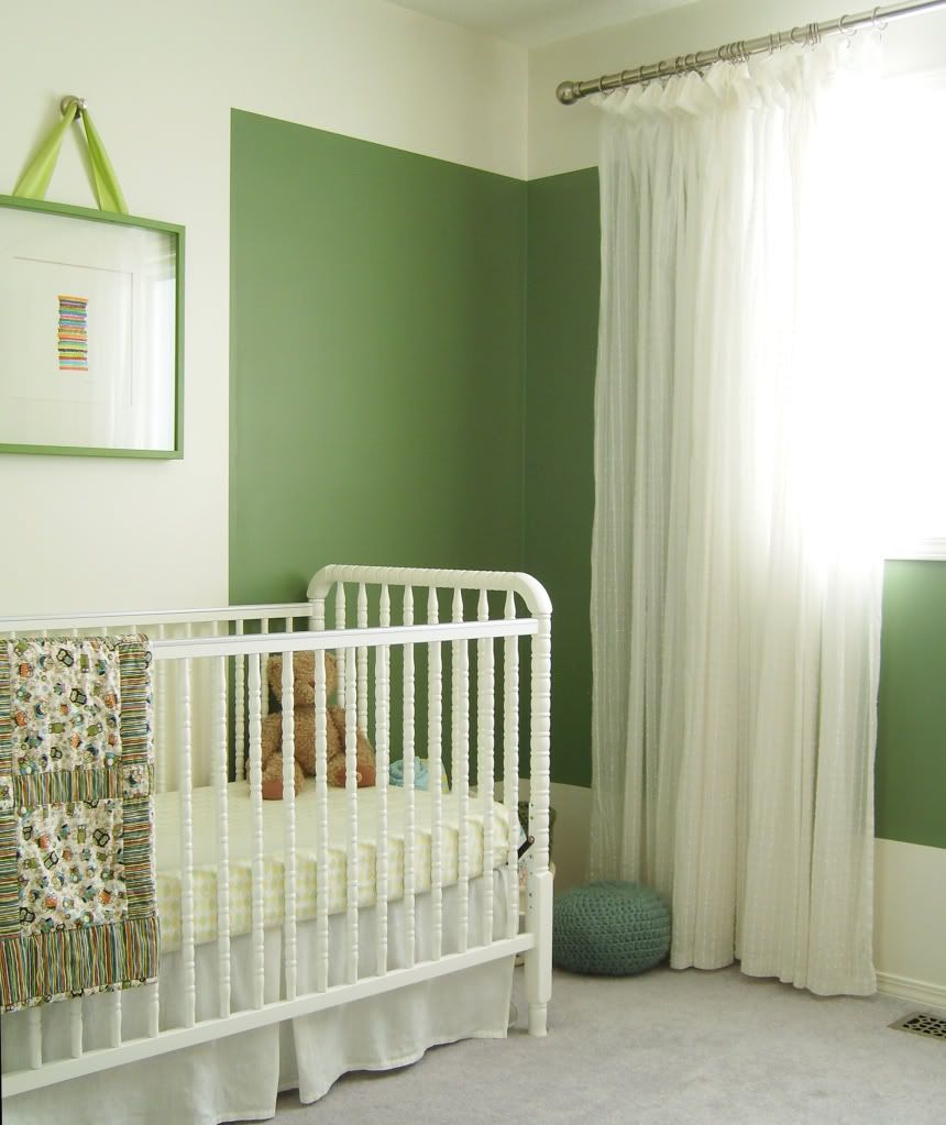
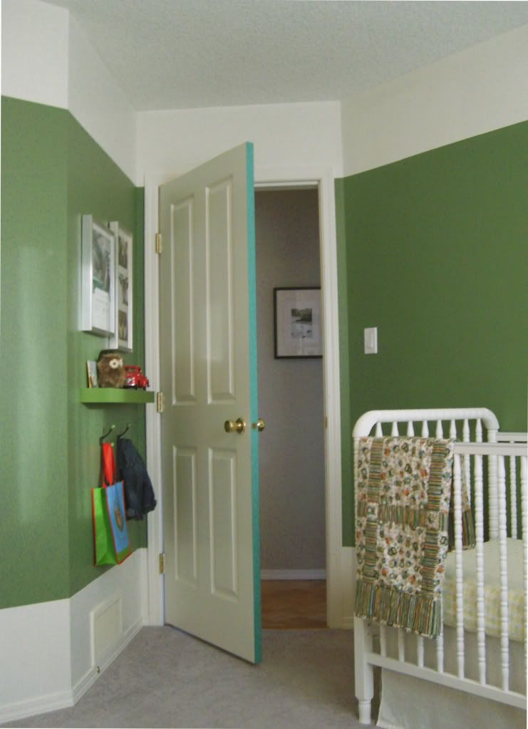
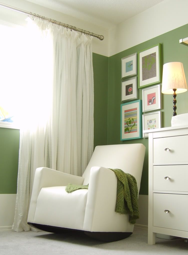
The room was a boring box so I decided to colour block the green paint on the walls. I used the same off-white paint on the doors, trim, baseboards & upper/lower walls. The green colour starts at 14" up from the floor & 14" down from the ceiling. Its painted as a horizontal band around the room breaking at the doors & window. I chose an off-white for the doors & trim, as opposed to a bright white, to soften the contrast with the darker green wall colour. The crib, dresser & rocker are all different shades of whites and I didn't want to make them look dingy by introducing a brighter white into the space.

white Jenny lind crib

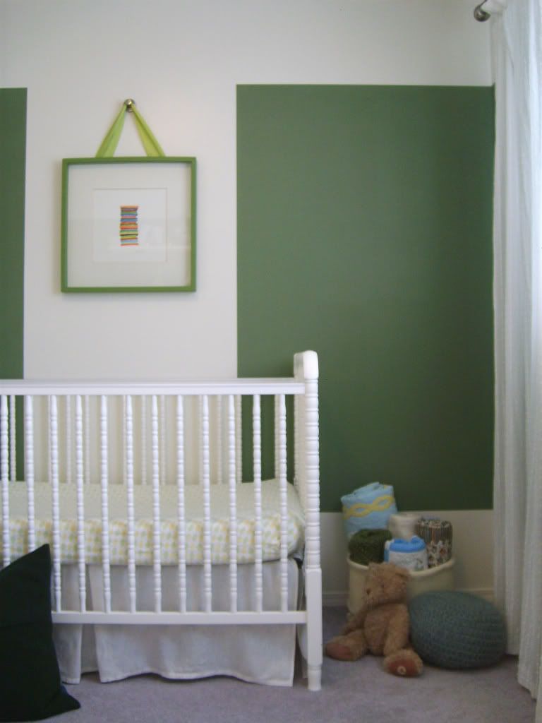
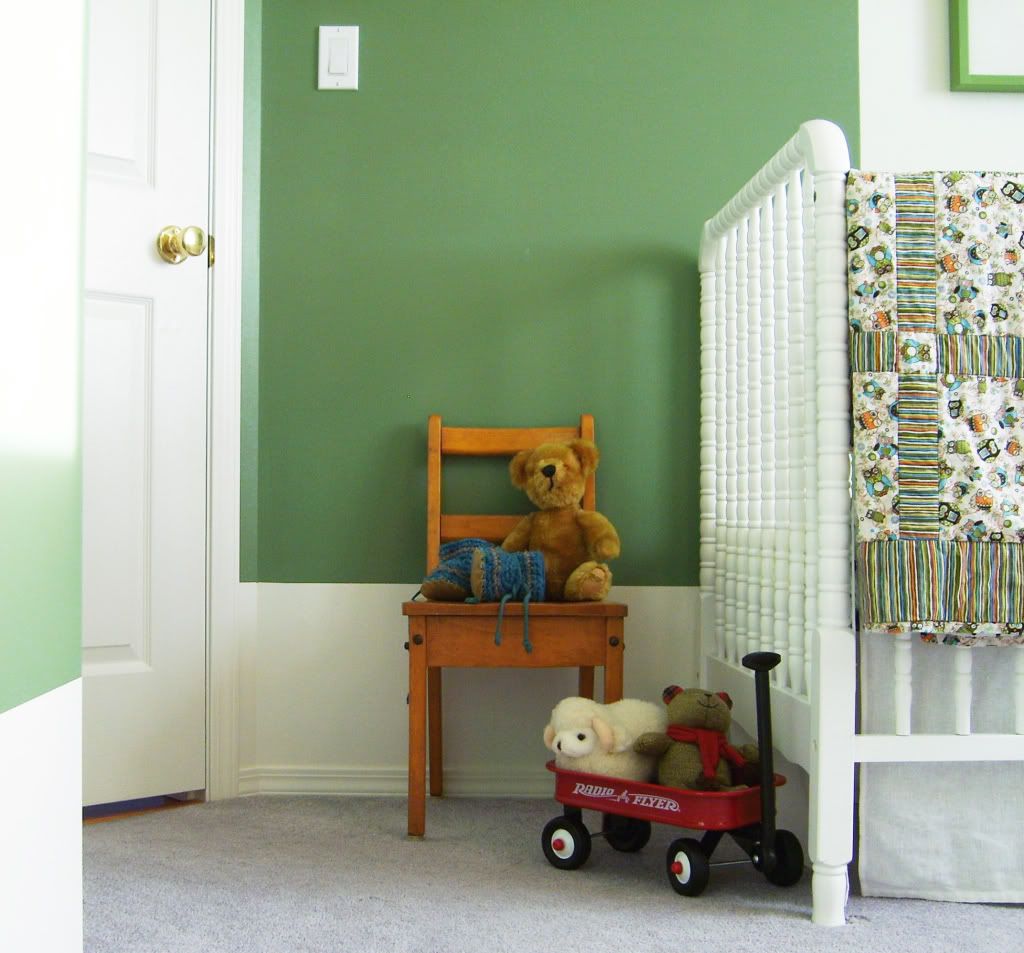
I also decided to break the green colour at the center of the crib wall to make the Jenny Lind crib & artwork above it stand out as more of a feature in the small space. It also helps balance the room by bringing a block of the off-white to that side of the room, matching the mass of the rocker & dresser. I painted an Ikea picture frame with the MS Bay Leaf and installed it above the crib.

white Jenny Lind crib

Beside the crib is a basket of quilts & blankets. Some quilts were hand sewn by my husband's grandmother for him as a baby. My mom made some of the other quilts & a felted blanket for our babe. My cousin crocheted the green blanket & the little pouf. I'm lucky that our families have sewing/quilting/crocheting talents. I wish it didn't skip me. Well, I've never actually tried, I'm just really talented in my lack of motivation sometimes.

Ikea dresser

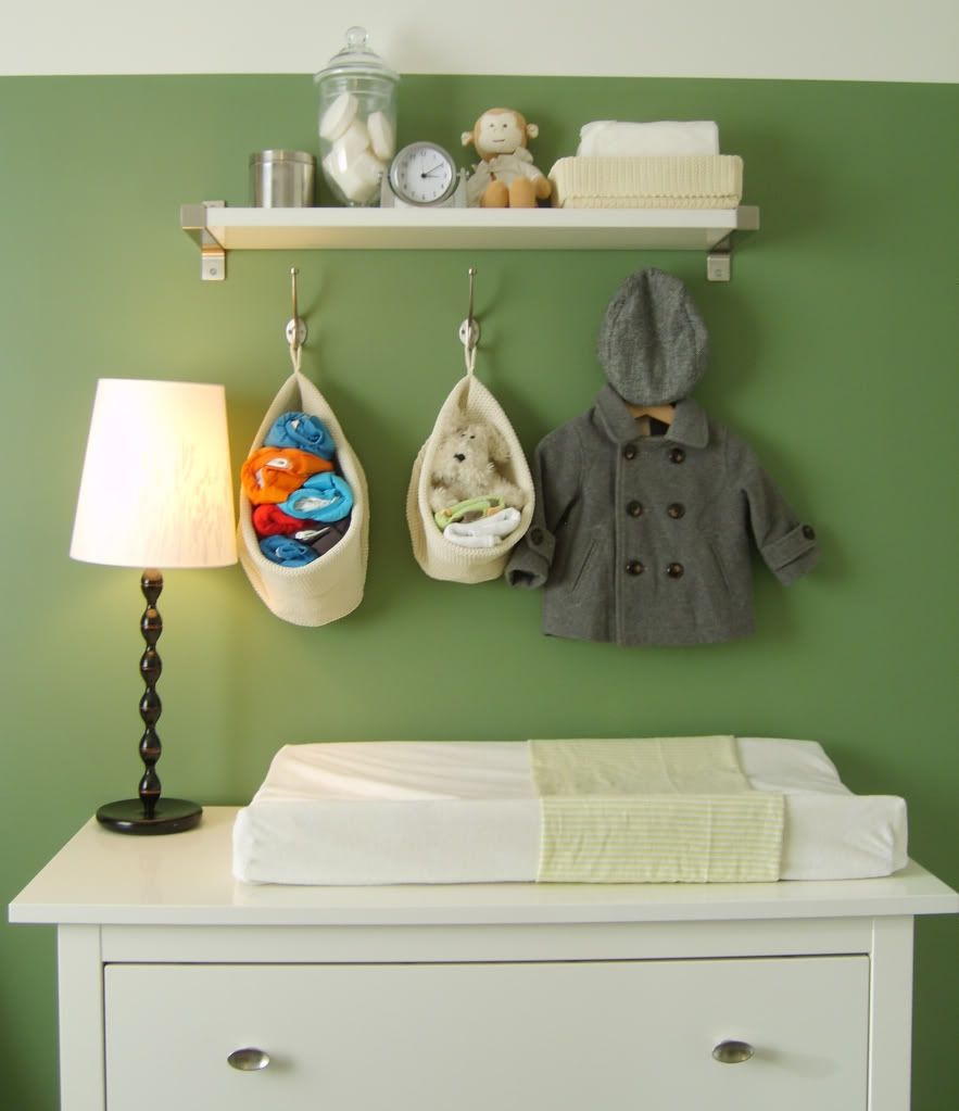
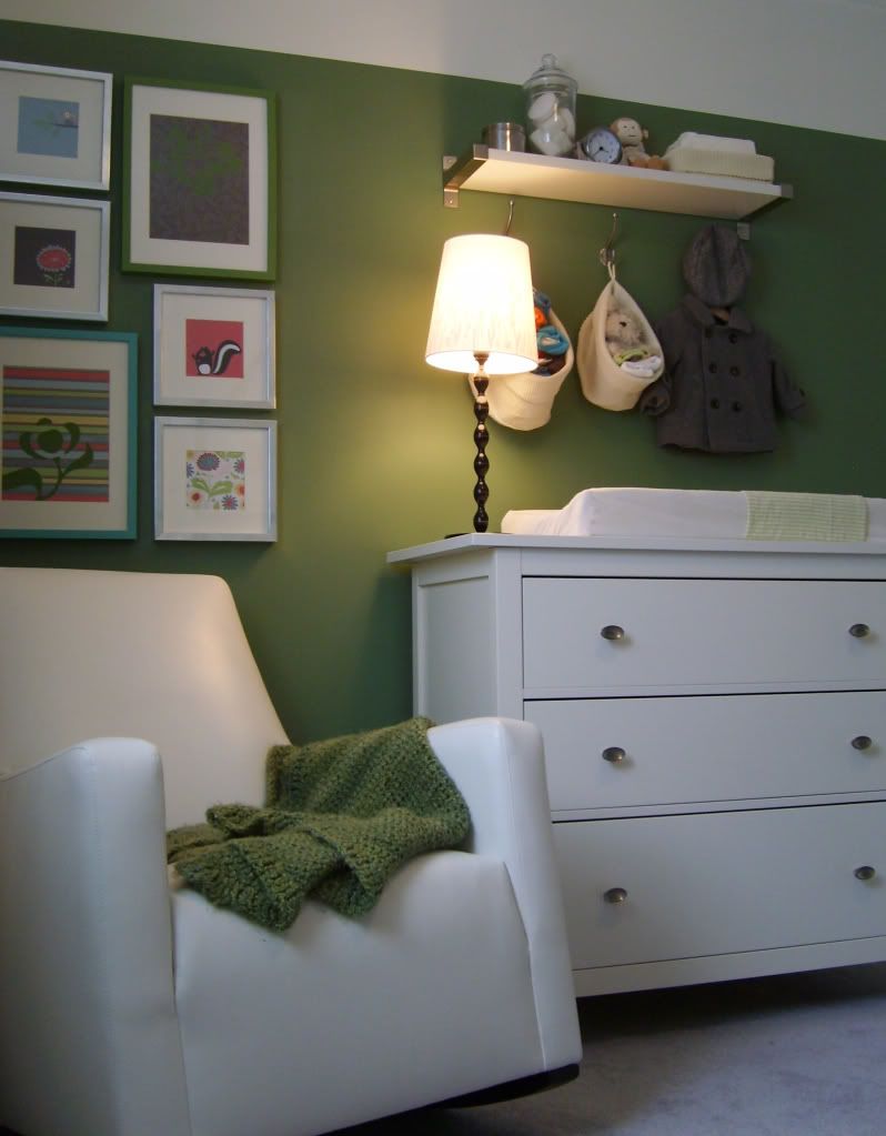
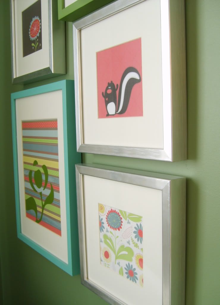
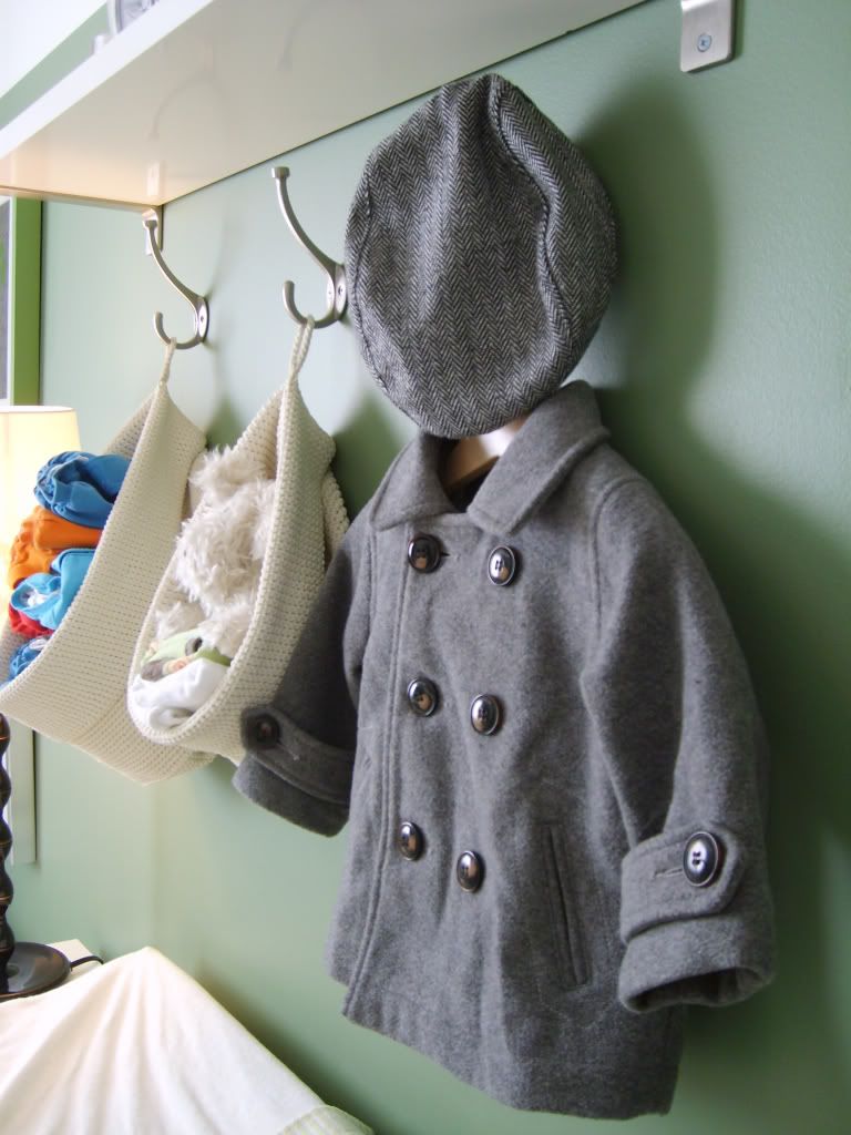
The dresser acts as a change table and the shelf & hooks hold/store all diapering items and some clothing/accessories. I love the Monte rocker with one exception: as all rockers do, it moves around. Sometimes too much but its comfortable. Very comfortable, especially when feeding &/or rocking a baby at 4:30 am. The art vignette above the rocker was made with Ikea frames & decorative paper that we had used in our previous nursery. I painted the two larger frames with the MS sample pots.

white Ikea dresser nursery art vignette Photobucket Pictures, Images and Photos

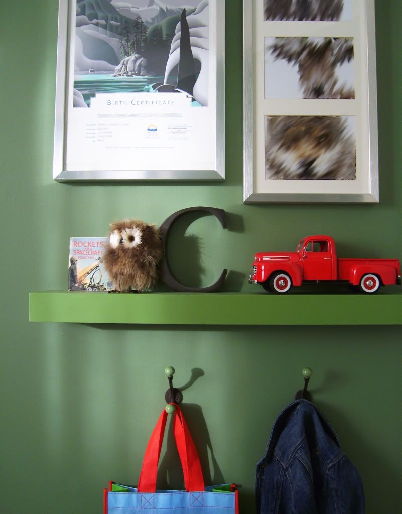
Behind the door is a floating shelf that was made for the last nursery, painted MS Bay Leaf. Above it is some art & photos and below are two hooks from Anthropologie. Since the green wall colour was chosen for a different space with different light, it is a LOT darker than I would normally select but budget, or lack of one, was a huge driving force behind design decisions here. We had it, so we used it! To try and brighten things up a bit & break the 'green-dom' of this corner, I painted only the jamb side edge of the door in MS Acuacana Teal (I saw that idea on the Lonny blog a few months ago).

gender neutral nursery Photobucket Pictures, Images and Photos

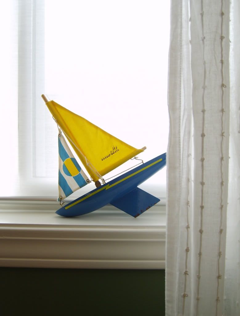
The hardware & sheer cotton drapery panels were, again, reused from the previous nursery but I added a new roller blind. I cut the Enjes blind from Ikea, to suit the window width, following this tutorial. I like how the blind filters in the natural light, as do the cotton drapery panels. Used together they're opaque enough for the little one to sleep, even on bright sunny days. The sheer white drapery panels fill this wall almost entirely when drawn closed which, again, helps to offset the darker wall colour.

nursery window treatment

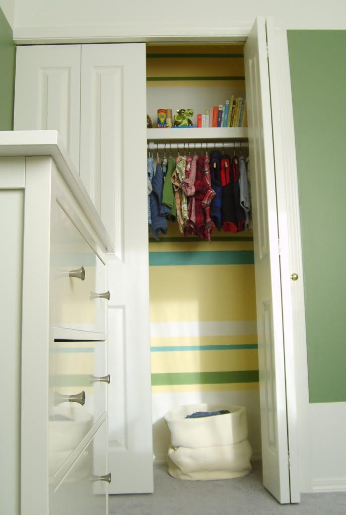
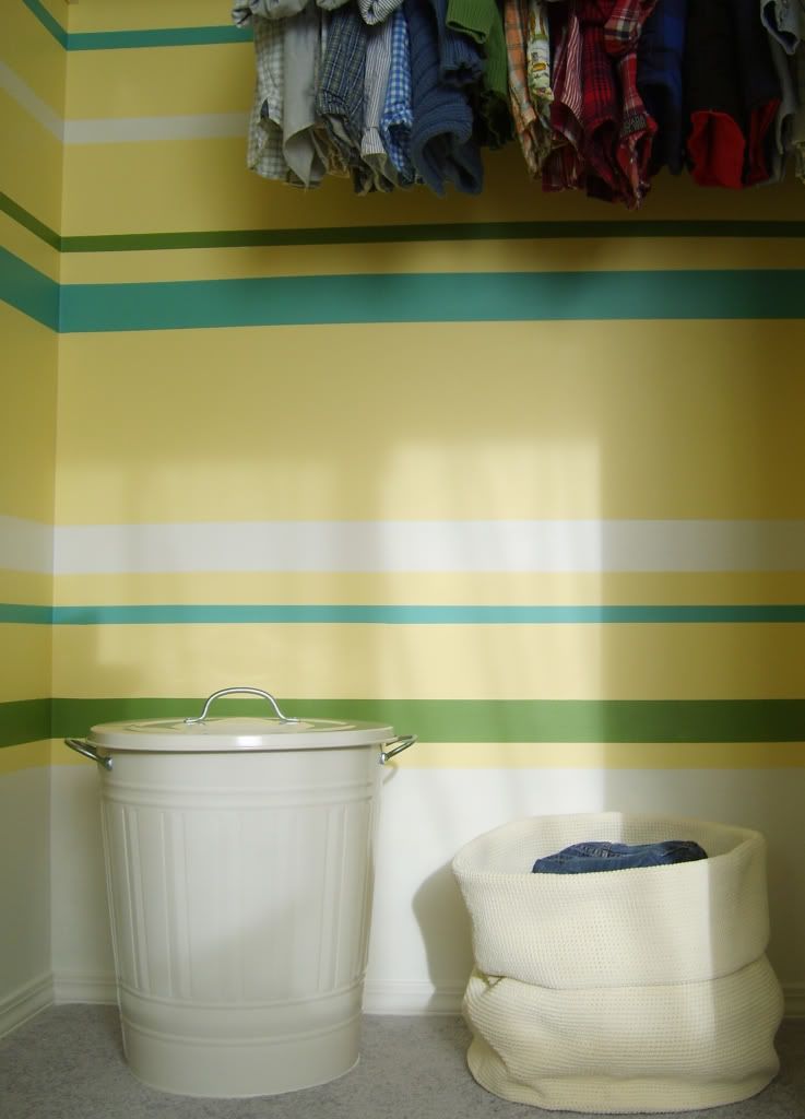
The closet. Oh the damn closet. I found a can of yellow paint in our storage room (we're not sure where it came from). It was a small can & the closet needed painting so there it went. Once it was done I realized that the combination of the green wall colour & buttery yellow was looking flat, boring, & yuck. I added off-white, green & turquoise horizontal stripes to brighten it up so I wont cringe every time I open the closet. The time involved in painting those stripes was insane. Insane! I'm glad it's done but there was some very tedious labour involved in that and I will never paint horizontal stripes inside a closet again.

kid closet Photobucket Pictures, Images and Photos

The closet rod, shelf & hardware were already there and installing nicer rods & hardware in a baby's closet is not very high on my priority list.  I'd like to add a shallower shelf above the existing one at some point, to maximize the vertical storage. I thought of adding another rod below to double the hanging space but there's enough clothing storage between the dresser & existing closet rod. I'd rather keep the bottom half more open as it is since our little guy likes to use the closet as a hiding space (hide-and-go-seek) & building forts.

Photobucket Pictures, Images and Photos

The existing grey carpet is here to stay for a while. My design resolution with it was basically just to ignore it. It's neutral enough that it doesn't clash with anything but I'm still keeping my eye out for a large flat weave area rug to layer over it. I bought a cheap ass light fixture for the ceiling. An Ikea hemma cord (in blue) with the round paper lantern shade. But then the paper shade ripped which is okay since I felt 'meh' about it anyways. I've got an idea to create a new shade and if it turns out to be too 'crafty' or d.i.y. looking, I'll just leave the boring 'builder special' fixture up until I buy a light that i really want.

kid wood chair

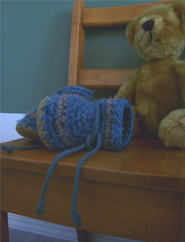
This little wood chair was gifted to us from my mother-in-law. She rescued it from my husband's elementary school years ago as it was being tossed in the trash. It's a great solid little seat. 

Photobucket Pictures, Images and Photos

I love, love, love these booties. They're knitted wool with sheepskin soles. Nice, warm & cozy on the inside with a non-slip suede bottom. They are too cute on little feet and I think every baby should have a pair.

So thats our nursery. It only cost us the price for one gallon of off-white paint, a roller blind, two hooks and a hella lot of my time & labour. But our little one loves it so I'm happy with that.
P.S. I'm working with just a little Samsung point & click camera so please excuse the quality of the photos. No fancy camera with a crazy lens here.

Follow my blog with Bloglovin

Sunday 5 February 2012

Our House

As boring as our house is, we still love it. Correction, as boring 'looking' as our house is, we still love it. When we did our first & only walkthrough, before purchasing it in early January 2011 (our little babe was only 4 months old), we were very 'underwhelmed' by the materials, finishes & detailing that this house has. It lacks any kind of character at all.
At.
All.
The furniture was terribly out-dated (not that it was staying, but furniture makes a huge impact on how you first perceive a space).There was no architectural detailing of any sort. The doors are blah. The windows are blah. The hardware is all shiny polished 80's brass (not the good, patina'd, matte or brushed brass I'm in love with). I can go on & on in the same manner about the plumbing fixtures, light fixtures, flooring, etc.....I'm sure you get what I'm saying. It's just so underwhelming. Anyways, the very thing that we hated about the house was what I LOVED about it! No one had come into this home since it was first built 17 years earlier and did any reno's or changes. That meant that we weren't going to be paying more for a shitty renovation that (chances would be at about 99.9%) I would absolutely HATE! And because we would have paid more for someone else's shitty renovation, we would have to live with it longer since it would take us longer to save money for the renovation/changes we want. Basically the ugly materials, out-dated finishes & lack of character are what sold me on this house. It's a clean slate for me to start with.

The size of the house also works for us. It's about 2500 square feet. Each floor is roughly 1250 sq ft. We were at that time living in a 900 sq ft condo w/2 bedrooms & 2 bathrooms. To go from that to a 5 bedroom, 4 bathroom house was crazy huge to us. The rooms are a small scale & the house size isn't McMansion big which is exactly what I wanted. First of all,  I do not want to clean a huge house and secondly, buy furniture that we wouldn't really use just because we needed to fill empty space. Not really our lifestyle or my personal design philosophy. So the size & scale of this house is good for us.

We also loved that the house has an ocean view. It's not ocean front but its across the street from the ocean. The entry & family room on the lower level and kitchen, living room, dining room on the upper level have amazing views looking out onto the Straight of Georgia at a couple northern Gulf Islands.

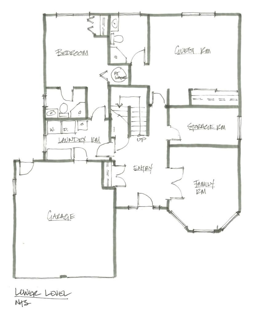
Following is the lower level plan:

Photobucket Pictures, Images and Photos

We like the larger entry. Just off of it is a large laundry/mud room which is great. My husband is currently using the family room off the entry as his office. We have a guest room with its own ensuite, a large storage room and another bedroom w/ensuite off the laundry room (that bedroom & the garage are currently being used by my husband for his business). We can do many things with the the lower layout but it all depends on what happens in our future, a long story for another post, but there's basically a Plan A, B or C in the works.

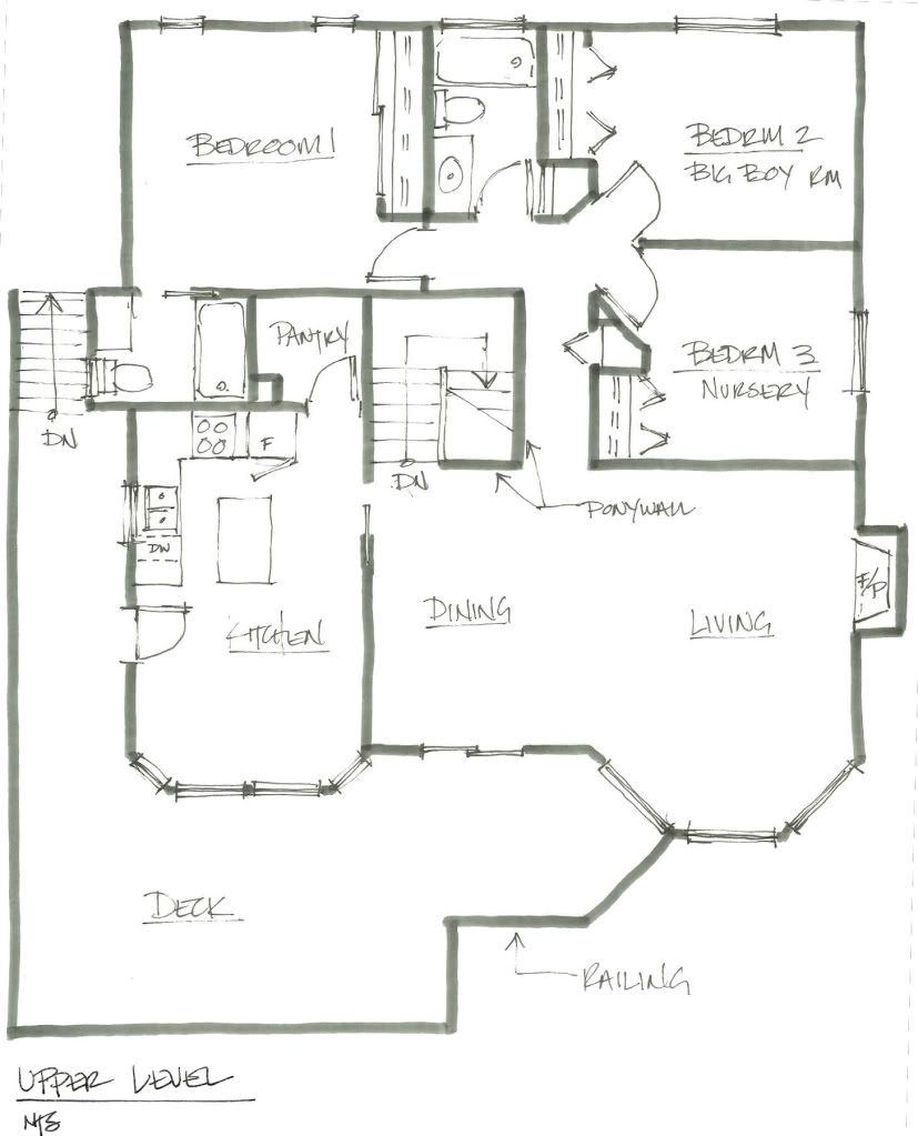
Following is the upper level:

Photobucket Pictures, Images and Photos

We like that there are three bedrooms and the kitchen, living & dining all on this level. The only major change to this layout is that the wall between the kitchen & living/dining area will come down. We'll expand the kitchen island (whenever that reno happens) to create more storage & counter height seating on the side facing the living space. We use the deck a lot & our neighbors said that the other, original owners never used it. Why you would build a deck facing the ocean & not use is beyond me? We also like that our house is two levels since all the homes to the left & right are single story ranchers and it makes our main living space feel a bit more private.

The only draw-back to my love of the ugly house finishes & lack of detailing is the work involved changing them which is a shitload. Every square inch of this house needs attention. Not one room is okay as it is. Someone who did a lot handy work here didn't know what the hell they were doing & did very weird things with very sloppy craftsmanship. The fun part is designing the house....I love designing it. Did I mention that I had this whole house re-designed two weeks after viewing it? BEFORE the real estate deal was even confirmed. Finishes, detailing, fixtures and all.  But holy shit is there a lot of work ahead of us. Just painting the nursery wiped me out and that was only a short term fix!

Please excuse the rough sketches, it's just to give an idea on the layouts of our home. I'll add proper furniture & finishes plans in the future.

And here we begin...

How to approach this first entry...I'll break it down simply into the five W's and approach it from the point of view of "someone who's stumbled upon this blog".

'Who'
I'm an interior designer, wife & mother recently transplanted from the city to a rural coastal home. We moved in the spring of 2011, with our baby boy, from a condo to a house! With an ocean view! We had to move far from the city to afford it but we own a house! And it may not be ocean front property but we love our "ocean view from across the street". We don't even notice the power lines cutting across our vista anymore.

'What'
This blog will be mainly about the design changes made to our house. Our home may only be 17 years old but words can't explain how much work this place needs (as will be evident from future images to be added).....its not necessarily offensive to most people (other than me), just really, really, really boring & blah. I will post pictures, sketches, renderings, plans & details of changes we make and  my future design ideas for the "big renovation" (which isn't anywhere near our immediate future). I might also post occasionally about other design projects I'm working on and anything I find particularly interesting or inspiring.

'Where'
Vancouver island, BC, Canada

'When'
My plan is start small & address the house one room at a time. I've got a schedule in mind, flexible of course, but a schedule none the less. Projects for clients will take precedence over our little place so things will shift as I go along, but I plan on working my ass off to get this house in a better state.

'Why'
Finding a way to show family & friends, both near & far, what my future design plans for our home is what initially got me thinking about a blog. When I show people my house, as we go through each room, I'm constantly explaining my ideas & details for future design changes. I see their eyes glaze over and they just slowly nod their head or quietly mumble something along the lines of "oh, I see"...then I know that I've lost them. A picture or sketch is truly worth a thousand words. I need to show sketches, drawings & images since words never can fully convey a design concept/intent. We can't afford to do any major renovations for the next few years so I'm trying to 'spruce' each room up as much as I can with as little money. I'll also show what my design plans are for the future 'big renovation' of each space through plans, elevations, sketches, concept images & renderings.

That's what this blog is for.

I didn't know I was so wordy or liked to use quotations so much.

Hopefully I'll learn how to edit better.Soon.